Radix UI
Open-source, accessible component library for building high-quality, design-system-ready React UIs.
Overview
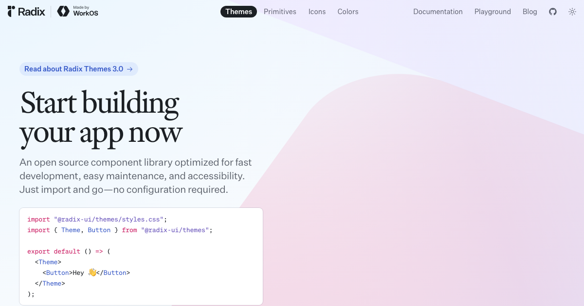
Radix UI provides two complementary tools: Radix Primitives — unstyled, WAI-ARIA compliant headless React components for building custom design systems — and Radix Themes — a fully styled, ready-to-use React component library with a polished design system built on the primitives. Both are open-source, maintained by WorkOS, and power the internals of shadcn/ui and hundreds of design systems.
What is Radix UI?
React-only component library providing both unstyled headless primitives (Radix Primitives) and a fully styled design system (Radix Themes), built on TypeScript with WAI-ARIA accessibility standards.
Best Suited For
"Design system engineers and teams building custom, branded UI kits who want a rock-solid accessible component foundation."
Key Features of Radix UI
- WAI-ARIA compliant components with full accessibility support
- Headless primitives for complete design system customization
- Radix Themes provides polished, styled components ready to use
- Powers shadcn/ui ecosystem and hundreds of design systems
- Full keyboard navigation and screen reader support out of the box
- Works with any CSS solution — Tailwind, CSS Modules, styled-components
- Maintained by WorkOS with stable, production-ready releases
Advantages
- Industry-leading accessibility — every component is WAI-ARIA compliant with full keyboard navigation and screen reader support.
- Unstyled primitives give teams full design control; pair with any CSS solution including Tailwind, CSS Modules, or styled-components.
- Maintained by WorkOS and powers major ecosystems including shadcn/ui, making it the most trusted headless React primitive library.
Limitations
- Primitives are unstyled — teams must implement their own visual design on top.
- Not a polished out-of-the-box design system; works best as a foundation for a custom one.