Best React UI Kits
React has no shortage of UI options, which is exactly why selection gets hard in real projects. This guide compares five widely used React kits in the Startup UI Kits directory and focuses on practical fit, not hype.
Data note: this roundup is reviewed against the latest 2026 directory snapshot.
How We Evaluated These Kits
To keep this editorial and useful, we looked at:
- Component depth for real product screens
- Accessibility defaults and keyboard behavior
- Styling model and long-term customization cost
- Documentation quality and team onboarding speed
- Maintenance signals (updates, ecosystem adoption)
Quick Comparison
| Kit | Best for | Styling model | Tradeoff to know |
|---|---|---|---|
| shadcn/ui | Product teams that want full UI control | Copy-paste + Tailwind + Radix | You own composition and long-term consistency |
| Radix UI | Teams building a custom design system | Unstyled primitives | More implementation work up front |
| Mantine | Teams that want speed with many built-ins | Styled component library + hooks | Heavier opinionated layer |
| Aceternity UI | Marketing-heavy pages with motion | Copy-paste Tailwind components | Best for expressive surfaces, less for dense app shells |
| Tailwind UI | Teams that value polished prebuilt layouts | Premium Tailwind components | License cost and less primitive-level control |
Why Use a React UI Kit?
A good kit should reduce delivery risk, not just speed up prototypes. In practice, the right kit helps teams:
- Ship consistent UI decisions across pages and teams
- Avoid rebuilding common accessibility behavior
- Keep design and engineering aligned as scope grows
- Reduce hand-rolled component maintenance
- Focus effort on product logic, not baseline UI plumbing
Top React UI Kits
shadcn/ui
shadcn/ui gives you production-ready component patterns built on Radix and Tailwind, but copied directly into your codebase. That means high flexibility and strong ownership.
Best fit when you want a custom product look without building every primitive from scratch.
- Strong for teams with in-house frontend capability
- Easy to evolve UI patterns over time
- Clear TypeScript support and broad community usage
Watch out for: since components live in your repo, consistency depends on your team discipline.
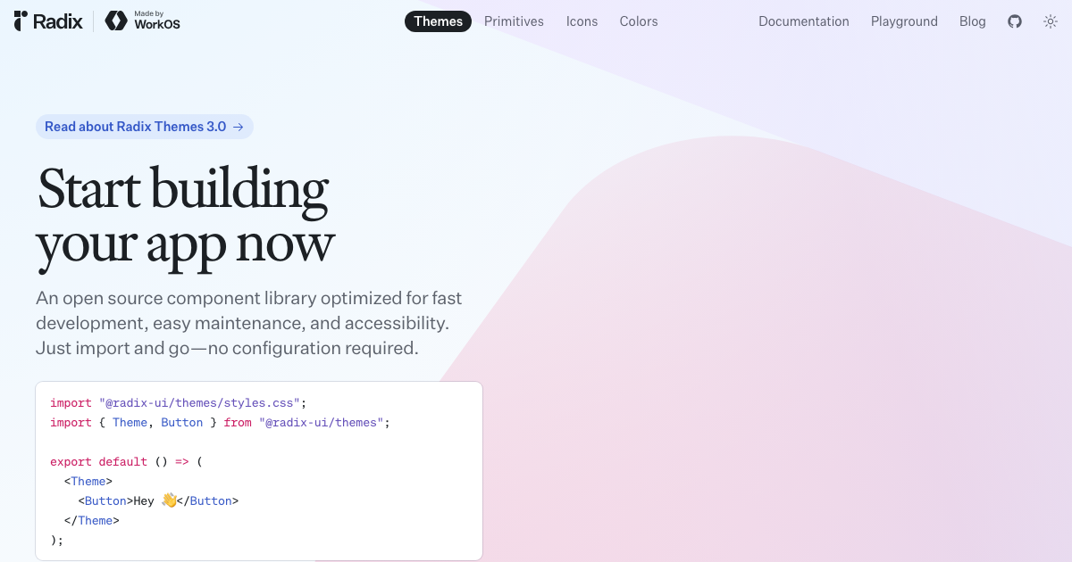
Radix UI
Radix UI is a primitive-first accessibility layer. It is excellent when your team wants a true design-system foundation and is comfortable owning visual styling entirely.
- Reliable accessibility baseline
- High composability for complex interaction patterns
- Often used underneath custom internal systems
Watch out for: it is not a visual kit by itself, so implementation scope is higher.
Mantine
Mantine is an all-in-one React component ecosystem with hooks, forms, and app-level building blocks. It is a practical choice for teams optimizing for implementation speed.
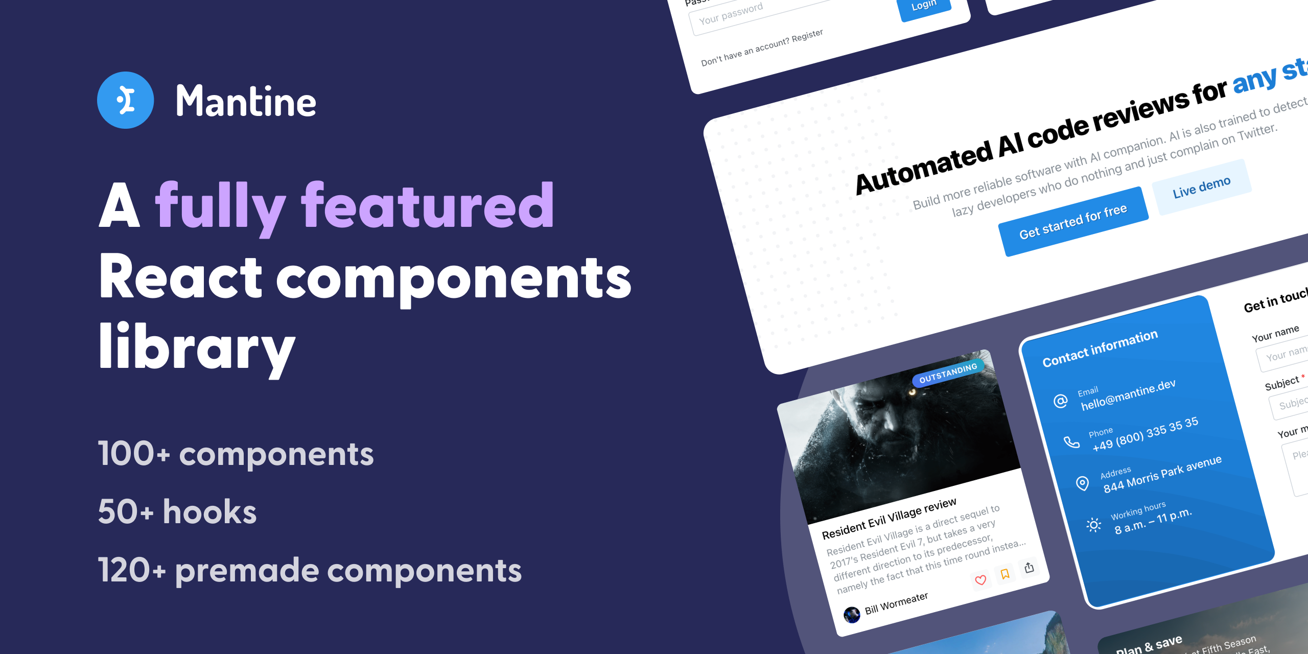
- Broad component coverage for dashboard and product UIs
- Good developer ergonomics for internal tools and SaaS panels
- Faster path for teams that prefer batteries included
Watch out for: visual/system customization can be more layered than primitive-first options.
Aceternity UI
Aceternity UI focuses on expressive sections and motion-rich components. It works well for marketing surfaces, launch pages, and visual storytelling.
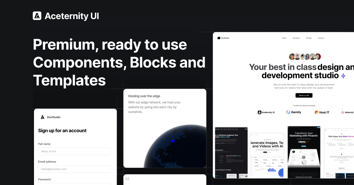
- Strong visual impact for hero sections and promotional flows
- Fast to assemble high-polish marketing pages
- Useful when brand expression matters early
Watch out for: it is less ideal as the only foundation for dense product CRUD interfaces.
Tailwind UI
Tailwind UI provides polished UI sections, app patterns, and layout blocks designed by the Tailwind team. It is often chosen for speed plus design consistency.
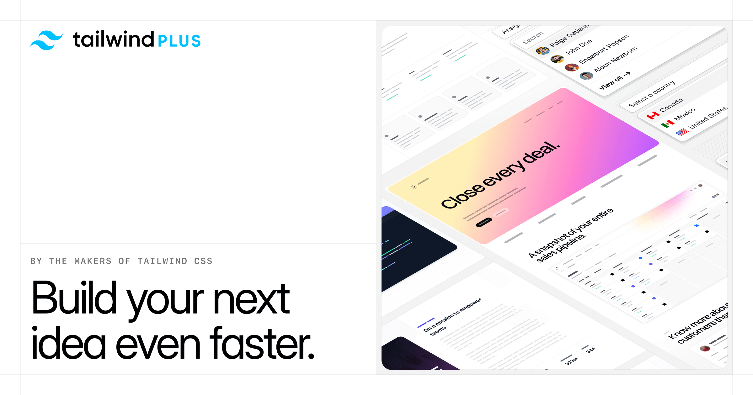
- High-quality defaults for product and marketing surfaces
- Great starting point for teams that already use Tailwind
- Predictable design quality across pages
Watch out for: it is a premium product and not primitive-level in the Radix sense.
Choosing the Right Kit
Use this quick filter before deciding:
- Need total design control? Start with Radix UI or shadcn/ui.
- Need broad built-ins quickly? Mantine is often the fastest path.
- Need polished marketing visuals? Aceternity UI or Tailwind UI.
- Need strict long-term consistency? Prefer primitives + internal conventions.
- Need immediate launch speed? Prefer opinionated kits with complete examples.
Editorial Takeaway
There is no universal winner. The best React UI kit depends on where your team sits today:
- Early-stage teams usually benefit from faster, opinionated systems.
- Growth-stage teams often move toward higher control and stronger internal standards.
- Marketing-heavy teams may combine one app-focused kit with one visual component source.